
Table of Contents
- Introduction: The Mobile-First Imperative
- Understanding Google's Mobile-First Indexing
- Responsive Design Fundamentals
- Mobile-Friendly Typography and Readability
- Core Web Vitals and Mobile Performance
- AMP vs. Responsive Design: Making the Right Choice
- Avoiding Mobile UX Pitfalls
- Content Structure for Mobile Consumption
- Testing and Monitoring Mobile Performance
- Conclusion: Future-Proofing Your Mobile Content Strategy
TL;DR: Mobile Optimization Essentials
With over 60% of global web traffic from mobile devices and Google's mobile-first indexing fully active, optimizing blog content for mobile is no longer optional—it's imperative. This guide covers responsive design, critical typography settings, Core Web Vitals, and content structuring techniques to ensure your blog offers an exceptional mobile user experience, boosts SEO, and maintains strong engagement. Leverage tools like PageSpeed Insights and Articfly's AI-powered content creation to stay ahead in the mobile-first landscape.
Introduction: The Mobile-First Imperative
In today's digital landscape, the screen that holds the most sway isn't a desktop monitor, but the mobile device in nearly every user's hand. Mobile technology has fundamentally reshaped how consumers access information, interact with brands, and consume content. This shift is not merely a trend; it represents a foundational change in web engagement, demanding that content creators prioritize mobile experiences above all else.
Compelling statistics underscore this imperative: Over 60% of global web traffic now originates from mobile devices, and a staggering 63% of consumers prefer mobile for information discovery. This pervasive reliance on smartphones and tablets means that if your blog content isn't optimized for these smaller screens, you're alienating the majority of your potential audience.
The urgency of mobile optimization has been further amplified by Google's unwavering commitment to mobile-first indexing. With the complete migration finalized in July 2024, Google now predominantly uses the mobile version of a website for indexing and ranking decisions. This means that a poorly performing or structured mobile site directly impacts your search engine optimization (SEO) performance and overall visibility.
Mobile optimization extends beyond mere aesthetics; it's about delivering a seamless and efficient user experience (UX) that keeps readers engaged and reduces bounce rates. For content creators, this translates into a direct link between mobile content strategy and business success. At Articfly, we understand this critical need, which is why our AI-powered platform is engineered to generate content that is inherently structured and optimized for the mobile-first world, ensuring your blog shines on every device.
Over 60% of global web traffic originates from mobile devices, and 63% of consumers prefer mobile for information discovery. If your blog isn't optimized, you're missing out.
Understanding Google's Mobile-First Indexing
Google's mobile-first indexing represents a pivotal shift in how search engines evaluate and rank websites. Historically, Google's crawlers primarily used the desktop version of a site to understand its content and determine its relevance. However, acknowledging the overwhelming prevalence of mobile usage, Google announced a gradual transition to a mobile-first approach, which became fully implemented for all websites by July 2024.
The core concept of mobile-first indexing is straightforward: Google primarily uses the mobile version of your website for indexing and ranking. This means that if your mobile site has less content, slower loading speeds, or poorer user experience compared to its desktop counterpart, your search rankings will suffer. Google's algorithm now prioritizes the mobile experience as the definitive representation of your site's quality and relevance.
This has profound implications for blog content creators. Any content, images, videos, or structured data that is only available on the desktop version will likely be ignored by Google's index. To ensure optimal mobile SEO, your mobile content should be equivalent to your desktop content, both in terms of information density and overall quality. This doesn't mean simply shrinking your desktop site; it requires a deliberate strategy to ensure all critical elements are present and accessible on mobile.
The consequences of non-optimized mobile sites are significant: decreased visibility in search results, lower organic traffic, and ultimately, reduced reader engagement. Bloggers must ensure their mobile content is not only crawlable and indexable but also offers a superior user experience. Articfly's AI content generation system builds articles with this mobile-first paradigm in mind, structuring content in a way that is easily consumable and fully discoverable by Google's mobile crawlers.

Responsive Design Fundamentals
Responsive design is the cornerstone of effective mobile optimization for blogs. It is an approach to web design that ensures content and layout fluidly adapt to various screen sizes and orientations, providing an optimal viewing experience across desktops, laptops, tablets, and smartphones. For blog content, this means ensuring readability and functionality regardless of the device used by the reader.
The essence of responsive design lies in its use of fluid grids, flexible images, and media queries. Fluid grids allow page elements to resize proportionally, rather than being fixed. Flexible images, meanwhile, automatically scale within their containers, preventing horizontal scrolling and ensuring they fit the screen without distortion. Media queries are CSS rules that apply different styles based on device characteristics, such as screen width, enabling designers to define specific layouts for different breakpoints (e.g., mobile, tablet, desktop).
Implementing responsive design for blogs involves several key considerations. Content must be structured to reflow gracefully, navigation should transform into mobile-friendly menus (like hamburger menus), and interactive elements must be easily tappable. Crucially, testing across multiple devices and browser types is non-negotiable to identify and rectify any layout or functionality issues. Common responsive design mistakes include failing to optimize images, having small touch targets, or using fixed-width elements that break the layout on smaller screens.
For bloggers, understanding these fundamentals is vital. A truly responsive blog eliminates the need for a separate mobile site, simplifying content management and ensuring a consistent brand experience. Articfly's AI content generation process inherently structures articles with responsive design principles in mind, using clear heading hierarchies, concise paragraphs, and optimized image placement to ensure a seamless adaptation across all devices. Our system helps lay the groundwork for a responsive content structure from the moment the article is generated.

Mobile-Friendly Typography and Readability
Optimal typography is paramount for ensuring readability and user engagement on mobile devices. A well-chosen and correctly implemented typographic strategy can significantly enhance the mobile reading experience, making your blog content accessible and enjoyable. Conversely, poor typography can lead to frustration and high bounce rates, regardless of content quality.
The first critical element is font size. For body text on mobile, a minimum of 16-18 pixels is recommended. Smaller fonts strain the eyes and make reading uncomfortable, especially for users with visual impairments or those in bright environments. Headings should be appropriately larger, maintaining a clear visual hierarchy that guides the reader through the content. Line height (leading) also plays a crucial role; aim for 1.4 to 1.6 times the font size to provide adequate spacing between lines, preventing text from feeling dense or cramped.
Paragraph length is another significant factor. On mobile screens, long blocks of text are intimidating and difficult to scan. Best practice dictates limiting paragraphs to 3-4 lines maximum. This creates more white space, breaking up the content into digestible chunks and improving scannability. Similarly, shorter sentences aid comprehension on smaller displays where the line length is limited.
When it comes to font choices, sans-serif fonts (like Arial, Helvetica, or Open Sans) are generally preferred for mobile screens due to their clean lines and better legibility at smaller sizes. While serif fonts (like Times New Roman or Georgia) can be elegant on desktop, their intricate details can become blurry or harder to distinguish on high-resolution mobile screens. Contrast ratios are also vital; ensure sufficient contrast between text and background colors to meet accessibility standards and enhance readability for all users.
Finally, implementing proper heading hierarchy (H2s, H3s, H4s) is essential for content structure. Not only does this aid SEO by signaling content importance to search engines, but it also creates visual breakpoints that make mobile content easier to navigate. Articfly's AI is programmed to structure content with these typographic best practices in mind, generating articles with appropriate font size considerations, optimal line spacing, and clear heading structures for maximum mobile readability.

Core Web Vitals and Mobile Performance
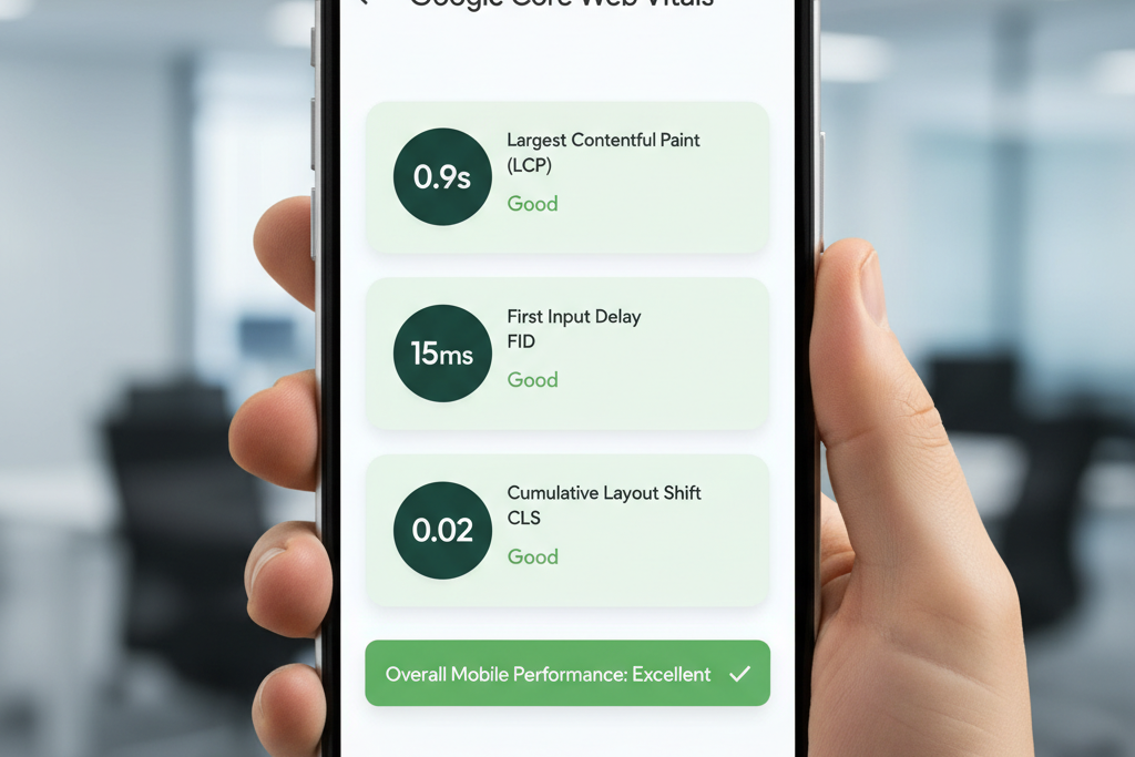
Core Web Vitals are a set of specific metrics that Google uses to quantify key aspects of user experience on a web page, particularly relating to speed, responsiveness, and visual stability. These metrics are a critical component of Google's page experience signals and significantly influence search rankings, making their optimization crucial for mobile performance.
The three Core Web Vitals are:
- Largest Contentful Paint (LCP): Measures loading performance. LCP reports the render time of the largest image or text block visible within the viewport. To provide a good user experience, pages should strive to have an LCP of 2.5 seconds or less.
- Interaction to Next Paint (INP): Measures responsiveness. INP observes the latency of all interactions a user makes with a page and reports a single, representative value. Pages should aim for an INP of 200 milliseconds or less.
- Cumulative Layout Shift (CLS): Measures visual stability. CLS quantifies the amount of unexpected layout shift of visual page content. Pages should maintain a CLS of 0.1 or less.
Optimizing these metrics is paramount for mobile users who often access content on slower connections or less powerful devices. Slow loading times (poor LCP), unresponsive interfaces (high INP), or sudden content shifts (high CLS) can lead to frustrating experiences, increased bounce rates, and a negative perception of your brand.
Tools like Google's PageSpeed Insights and Search Console are indispensable for measuring and monitoring your Core Web Vitals. These tools provide actionable recommendations for improvement, such as optimizing image sizes, deferring non-critical CSS/JavaScript, implementing lazy loading for media, and ensuring fonts are preloaded.
Impact on user engagement is direct: faster, more stable, and responsive pages lead to longer dwell times, higher conversion rates, and improved reader satisfaction. For blog content, this means ensuring your articles load quickly and smoothly on mobile, allowing readers to focus on the information rather than struggling with technical glitches. Articfly's platform is designed to produce clean, efficient content that contributes positively to these vital metrics, ensuring your articles perform optimally on mobile devices.
AMP vs. Responsive Design: Making the Right Choice
When optimizing content for mobile, two prominent strategies often come into discussion: Accelerated Mobile Pages (AMP) and responsive design. Both aim to enhance the mobile user experience, but they achieve this through fundamentally different approaches, each with its own benefits and limitations.
Accelerated Mobile Pages (AMP) is an open-source framework developed by Google to create fast-loading mobile pages. AMP achieves its speed by restricting HTML, CSS, and JavaScript to a specific set of rules, often relying on Google's AMP Cache to deliver content almost instantaneously. Pages built with AMP are designed to load near-instantly, providing an extremely quick user experience, especially beneficial for news articles and similar content where speed is paramount. Benefits include superior speed, preferential treatment in Google's search results (like the "Top Stories" carousel), and a streamlined user experience.
However, AMP also comes with limitations. Developing AMP pages can add complexity, as it requires adherence to strict coding standards, which can restrict certain interactive features or custom branding elements. Maintaining separate AMP versions alongside standard web pages can also increase development and content management overhead.
Responsive design, as discussed earlier, uses fluid grids, flexible images, and media queries to adapt a single codebase to all screen sizes. It prioritizes flexibility and consistency, allowing for a unified brand experience across all devices. The primary benefit of responsive design is its "write once, publish everywhere" approach, which simplifies content management and reduces development costs compared to maintaining separate mobile sites or AMP versions.
The choice between AMP and responsive design often depends on the specific content type and business goals. For blogs that heavily rely on news, breaking content, or a high volume of articles where immediate access is critical, AMP can provide a competitive edge in speed and visibility. However, for most general blogs, e-commerce sites, or platforms requiring complex interactive elements and deep customization, responsive design offers a more robust, flexible, and maintainable solution.
Current industry trends show a gradual shift away from AMP as a sole solution, with Google increasingly emphasizing Core Web Vitals and overall page experience as ranking factors, which responsive designs can achieve. Google's position has evolved to promote any fast, user-friendly page, not just AMP. For most blog content, a well-implemented responsive design that adheres to Core Web Vitals best practices provides the optimal balance of user experience, SEO benefits, and development efficiency. Articfly focuses on generating content that is inherently optimized for responsive layouts, ensuring robust performance without the constraints of AMP.
For most blog content, a well-implemented responsive design that adheres to Core Web Vitals best practices provides the optimal balance of user experience, SEO benefits, and development efficiency.
Avoiding Mobile UX Pitfalls
Even with responsive design and optimized content, several common pitfalls can derail the mobile user experience (UX) on a blog. Identifying and proactively addressing these issues is critical to maintaining reader engagement and ensuring positive SEO outcomes.
One of the most aggravating mobile UX pitfalls is the use of **intrusive pop-ups and interstitials**. While designed to capture leads or promote offers, these overlays can block content, be difficult to close on small screens, and trigger penalties from Google, which specifically targets mobile pages with obtrusive interstitials. Prioritize less disruptive methods for calls-to-action or opt-in forms, such as inline elements or small banners.
**Touch target sizes and spacing** are another frequent oversight. On mobile, users interact with their fingers, not a precise mouse cursor. Buttons, links, and navigation items must be large enough (typically 48x48 pixels) and have sufficient spacing around them to prevent accidental taps. Close proximity of interactive elements can lead to frustration and navigation errors.
**Navigation menu optimization** is paramount. Traditional desktop menus are cumbersome on mobile. Implement a concise, intuitive mobile navigation system, often utilizing a "hamburger" menu icon that expands to reveal options. Ensure the menu is easy to open, navigate, and close, providing clear paths to essential content categories.
**Form optimization for mobile** means simplifying inputs. Minimize the number of fields, use appropriate input types (e.g., number keyboard for phone numbers), provide clear labels, and ensure large, tappable submit buttons. Auto-fill features should be enabled where possible to streamline the process.
**Image optimization and lazy loading** are critical for performance. Large, unoptimized images can drastically slow down page load times on mobile. Compress images without sacrificing quality, use modern formats like WebP, and implement lazy loading, which defers loading images until they are about to enter the viewport. This significantly reduces initial page weight and improves LCP.
Finally, **reducing overall page weight and load times** is a comprehensive effort. This includes minifying CSS and JavaScript, leveraging browser caching, and choosing a fast web host. Every millisecond counts for mobile users. By systematically addressing these mobile UX pitfalls, blogs can create a more enjoyable and efficient experience, keeping readers engaged and search engines satisfied. Articfly's content generation considers these elements by producing clean, lean HTML structures and promoting best practices for media integration.

Content Structure for Mobile Consumption
Optimizing content structure specifically for mobile readers is about more than just responsive design; it's about tailoring the presentation of information to suit different reading patterns and attention spans on smaller screens. Mobile users often scan content quickly, seeking immediate answers or key takeaways. Therefore, your content needs to be highly scannable and digestible.
The first rule is to adopt **shorter paragraphs and sentences**. Long blocks of text, as discussed in the typography section, are visually overwhelming on a smartphone. Break down complex ideas into concise sentences and limit paragraphs to 2-4 lines. This creates more white space, making the content less intimidating and easier to skim.
**Strategic use of headings and subheadings** is crucial. These act as signposts, guiding readers through the article and allowing them to quickly identify relevant sections. Use descriptive H2s and H3s that clearly summarize the content below, enabling users to jump directly to sections of interest. This not only improves UX but also enhances SEO by providing clear topical signals to search engines.
**Bullet points and numbered lists** are incredibly effective for mobile consumption. They break up dense information, highlight key points, and make complex data or instructions easy to follow. Whenever possible, convert paragraphs of enumerated points into lists for improved readability.
**Embedded media placement** requires careful consideration. Images and videos should be strategically placed to complement the text without disrupting the flow or causing excessive scrolling. Ensure media is responsive and loads quickly. Avoid placing crucial information solely within images, as it may not be accessible to screen readers or users with slow connections.
**Call-to-action (CTA) optimization** for mobile involves making CTAs clear, concise, and easy to tap. Use prominent buttons with clear action verbs, and ensure they are sufficiently spaced from other elements. Position CTAs where they naturally fit within the content flow, often at the end of sections or after key arguments, rather than as intrusive pop-ups.
Understanding mobile reading patterns—often characterized by scanning in an "F" pattern or looking for bolded text—can inform your content formatting decisions. Prioritize important information at the beginning of paragraphs and use bolding sparingly to emphasize key terms. Articfly's AI content generation system is designed to produce content with these mobile-first structural principles embedded, ensuring your articles are not just written well, but also presented optimally for the modern mobile reader.
Testing and Monitoring Mobile Performance
Mobile optimization is not a one-time task; it is an ongoing process that requires continuous testing, monitoring, and refinement. Regular audits and performance checks ensure that your blog consistently delivers an excellent mobile experience and maintains its SEO standing.
Google provides several indispensable tools for this purpose:
- Google's Mobile-Friendly Test: This simple tool allows you to input a URL and quickly ascertain if Google considers your page mobile-friendly. It identifies specific issues like small text, unclickable links, or content wider than the screen.
- PageSpeed Insights: This tool provides a comprehensive analysis of your page's performance on both mobile and desktop, including Core Web Vitals scores and actionable recommendations for improvement across various metrics like image optimization, server response times, and CSS/JavaScript delivery.
- Google Search Console: Under the "Experience" section, Search Console offers detailed reports on Core Web Vitals, Mobile Usability, and HTTPS usage across your entire site. It helps identify pages with performance issues and tracks improvements over time.
Beyond Google's tools, incorporating **real user monitoring (RUM)** tools can provide invaluable insights into how actual users experience your site. RUM platforms collect data on page load times, interaction delays, and other performance metrics directly from visitor browsers, offering a more accurate picture of real-world performance than synthetic testing alone.
**Cross-browser and cross-device testing** are also crucial. While responsive design aims for universal adaptability, rendering can vary slightly across different browsers (Chrome, Safari, Firefox) and device models. Manually testing on a range of popular devices or using emulation tools can help catch these subtle inconsistencies.
Establishing a routine of **regular performance audits**—perhaps quarterly or after significant site updates—ensures that newly published content or design changes do not inadvertently degrade mobile performance. Finally, setting up **mobile-specific analytics** within platforms like Google Analytics allows you to segment data by device type, enabling you to track mobile bounce rates, conversion rates, and engagement metrics, providing a clear picture of your mobile audience's behavior and the effectiveness of your optimization efforts.
Conclusion: Future-Proofing Your Mobile Content Strategy
The journey to comprehensive mobile optimization is continuous, but the destination—a highly engaged audience and improved search visibility—is well worth the effort. By embracing a mobile-first mindset, blog content creators can ensure their valuable articles reach and resonate with the vast majority of today's internet users. We have covered the critical elements that form a robust mobile content strategy: understanding Google's mobile-first indexing, implementing responsive design, perfecting mobile-friendly typography, optimizing for Core Web Vitals, making informed decisions between AMP and responsive, avoiding common UX pitfalls, and structuring content for optimal mobile consumption. Each of these components plays an integral role in future-proofing your blog for the evolving digital landscape.
The imperative for continuous optimization cannot be overstated. As mobile technology advances and user expectations shift, keeping abreast of emerging mobile trends—such as voice search optimization, progressive web apps (PWAs), and increasingly sophisticated interactive elements—will be key to maintaining a competitive edge. Embracing these evolutions will ensure your content remains relevant and accessible.
At Articfly, we empower content teams by generating high-quality, SEO-optimized blog articles that are inherently structured for mobile readability and performance. Our AI system integrates best practices from the ground up, providing a powerful foundation for your mobile content strategy. Leverage Articfly to streamline your content creation process, freeing you to focus on strategic oversight and continuous refinement of your mobile experience.
Ready to ensure your blog content shines on every screen? Start implementing these mobile optimization strategies today, and see your engagement and SEO performance soar. Discover how Articfly can help you create mobile-optimized content effortlessly.